Here is a rant.
What is wrong with Google? Great search engine, no sense with anything else. Android phones captured the market, except iPhone makes all the money. Self-driving cars are cool, except Tesla is about the batteries. Finally, I like Google Play: excellent selection, works reliably in the browser and on my phone. Yet it seems there is no one with any sense or product management experience driving the user interface there!
Let us take a look at a simple but important feature every music service has. You can give a song a "thumbs up" and it will be added to a special playlist of songs the user likes. Sounds reasonable, right? Listening to music is an emotional experience, and the better a company serves my most favorite songs, the more I like the company's music service.
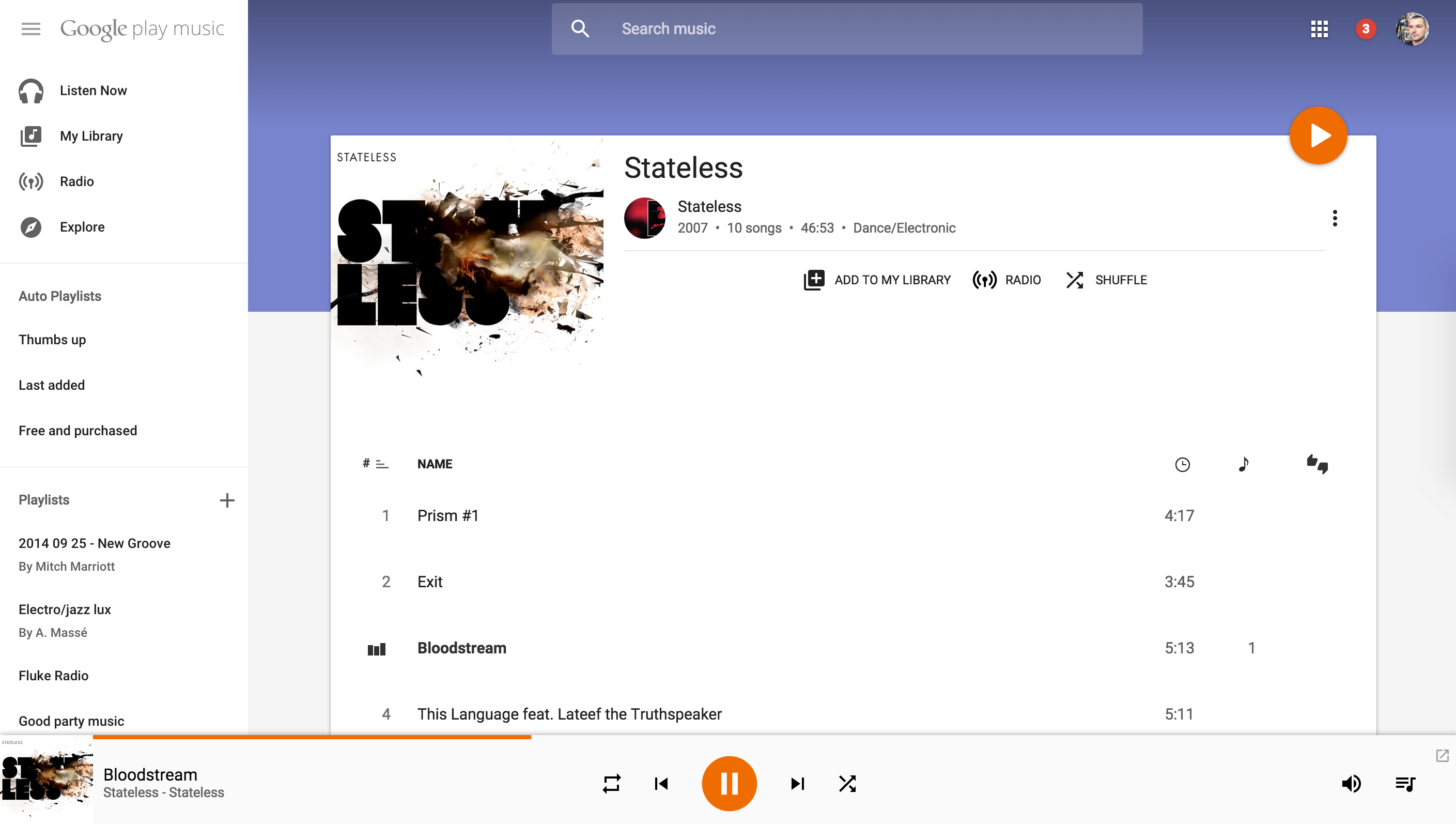
Let us look at the awful visual design Google Play chose to implement this feature. The song is playing in a playlist or in one of the radio stations. I like it and want to save it as my favorite by giving it thumbs up. Can you guess how to do this?
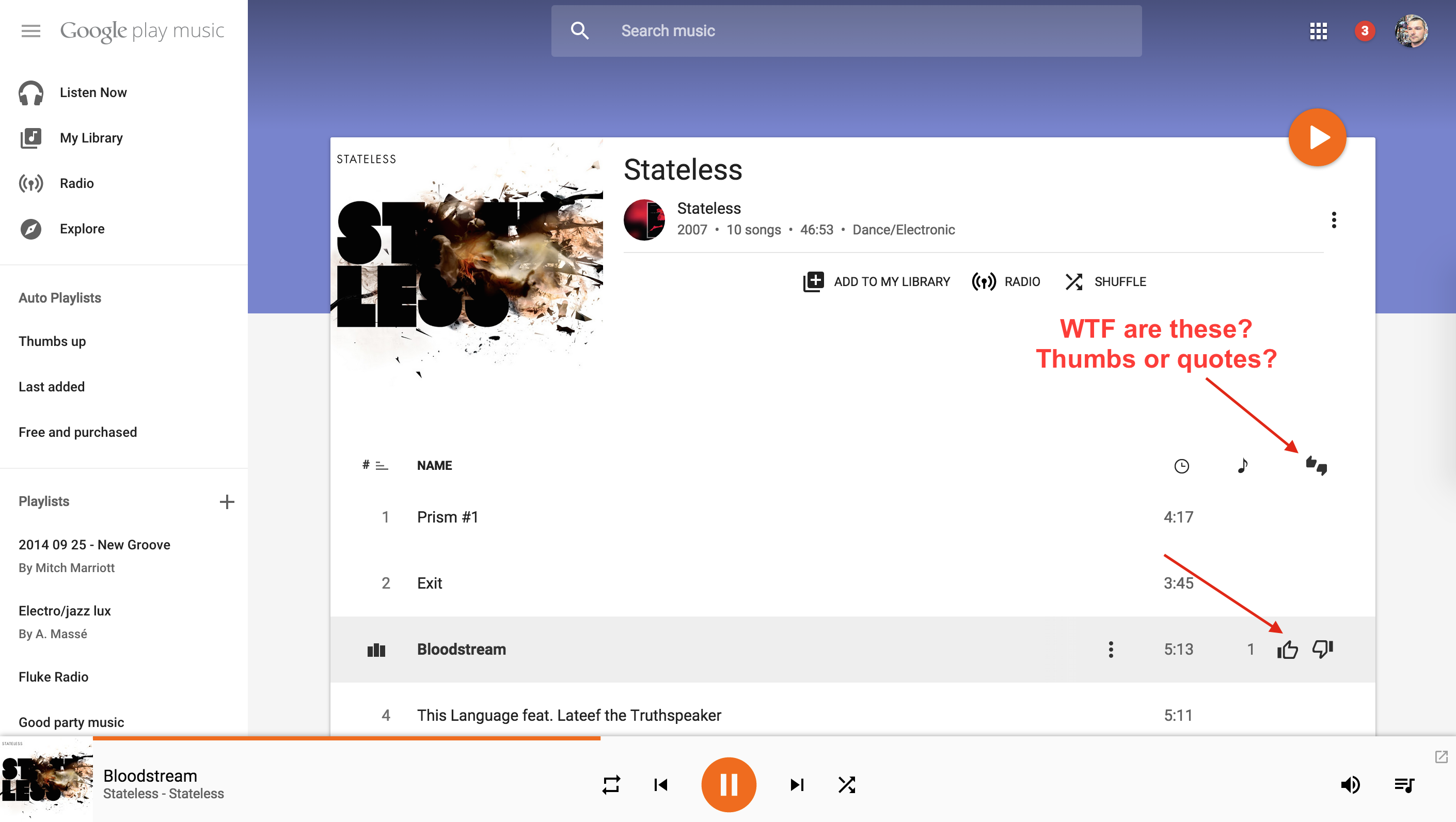
Ok, time is up; the song has finished playing. Hover over the song in the list. See, the thumbs up and down icons have appeared in the right-most column. Wait, are these thumbs in the column header? No way, I thought these were quotes!
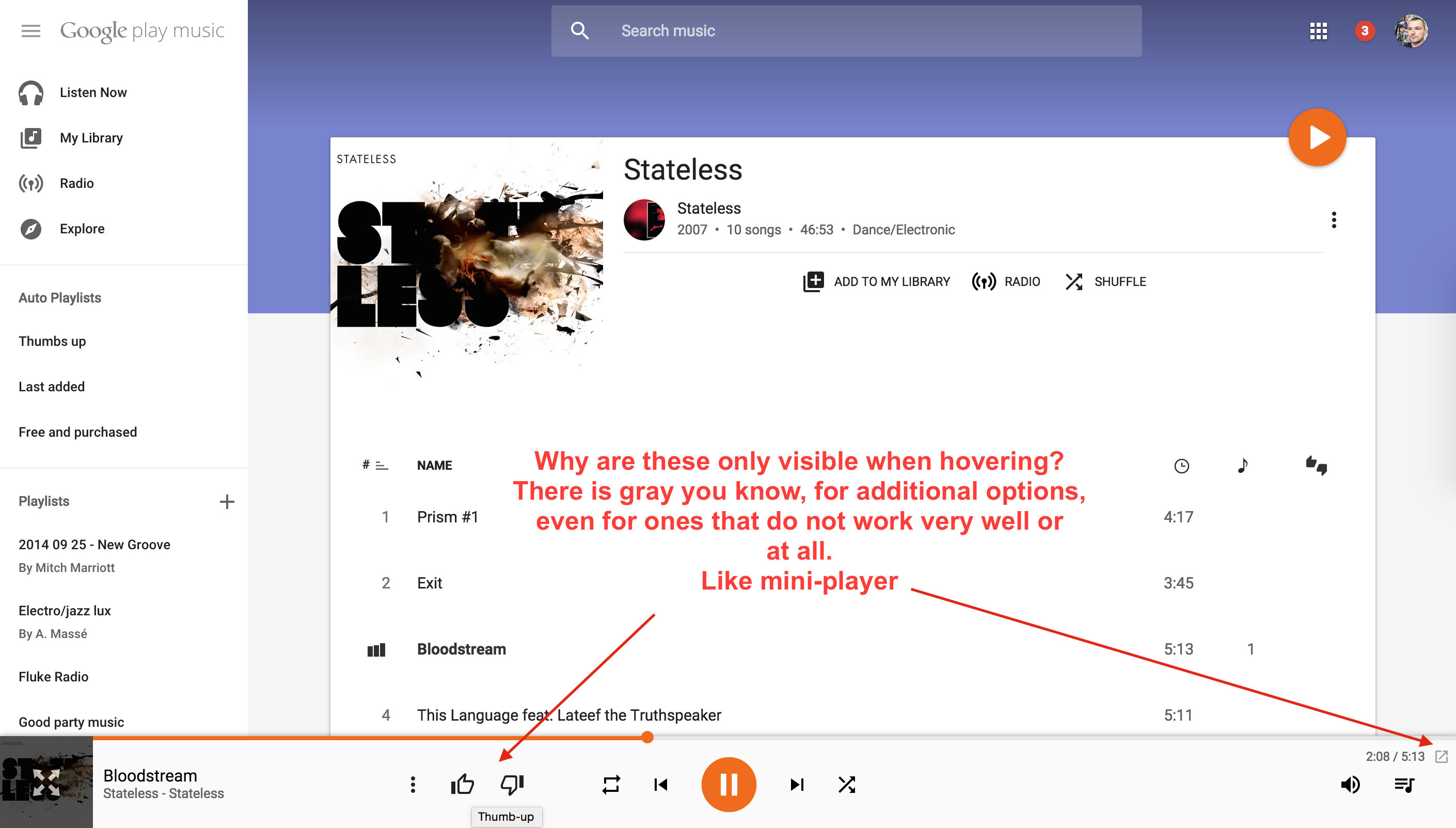
Maybe I am unfair. Clean design is usually an attractive feature. Maybe the thumbs up button is in the music control area, down at the bottom. Oops, you need to hover there too to make these buttons visible!
Who completely hides an important feature and then lags behind its competitors? I know who: Google.
By the way, the last little surprise. See the triple dots next to the thumbs up icon? This reveals what the tooltip calls "Additional playing actions" when hovering over the play controls. When hovering over the song list the same is called "Additional song actions". These two lists of actions are the same, except the "Additional song actions" includes the "Buy" option. Why there and not in both? I don't know.
I do not want to appear too angry about these flaws, but for a company with lots of resource and rich history, not to have someone call this user interface design what it is - awful - is U-N-B-E-L-I-E-V-A-B-L-E. Bad, bad, bad.
I can only guess what is going inside Google. Maybe they put their resources into making the music load quickly and play without interruptions. It does seem to work most of the time just fine. Yet, it seems there is no one who really cares about the product features and how they look and interact together. It could be a bad user interface design, but I suspect this is just bad product management and not having a consistent view of what features are the most important and cannot be hidden.
Last little user interface nugget: the iOS Google Play app does NOT have any way to "thumb up" a song. Or maybe I have not poked enough blindly at different areas to find it. One would think that Google has a way to add built-in song recognition (like Shazam) and all sorts of learning from the music I liked (like Mixcloud or Netflix), but one would be wrong. Sad.
Update 1
Google Play iOS app has thumbs up and down - when the song takes up the entire screen, not when it is playing in the list. I apologize for not noticing this before.