Adding Dark Theme to Cypress.Tips Site

How I added and tested a dark color theme at my site cypress.tips

Recently I got an email thanking me for the work I have done for the Cypress community. The email also asked why I haven't added a dark color theme at my site cypress.tips where I keep my courses, my search, etc. Let's do this. I will define a second color theme using CSS variables, will use a React component to save and load the current color theme, and will write a Cypress end-to-end test to verify it all works together.

Previous work

I have already shown how to write Cypress tests for a React dark theme toggle component "DarkMode". You can see the app and the tests in the repo bahmutov/react-dark-mode. See the tests in the short video I have recorded below:

Let's apply this component to my Next.js React application.

CSS variables

The first thing we want to do is to make sure all colors are defined using CSS variables. In my case, the default is the light color theme, the alternative will be using attribute selector "data-theme=dark". We define the text color, the background color, the link colors, and maybe a few other colors.

globals.css
1
2
3
4
5
6
7
8
9
10
11
12
13
14
15
16
:root {
/** light theme colors **/
--color-back: #fff;
--color-front: #444;
--color-headings: #222;
--color-link: blue;
--color-link-visited: #0070f3;
}
/** dark theme colors **/
[data-theme='dark'] {
--color-front: #eee;
--color-back: #333;
--color-headings: #29c15b;
--color-link: #7acbe6;
--color-link-visited: #7acbe6;
}

Using these variable names, we define actual CSS properties. For example, the body of the document needs the text color and the background colors.

globals.css
1
2
3
4
5
html,
body {
color: var(--color-front);
background-color: var(--color-back);
}

I am using CSS modules to give styles to my React components. For example, the Card components need to change their color on hover. Again, we use the root CSS variable names to make the current theme apply:

Home.module.css
1
2
3
4
5
6
.card:hover,
.card:focus,
.card:active {
color: var(--color-link);
border-color: var(--color-link);
}

While creating the color, I set the data attribute on the custom Next Document component to see it immediately

_document.js
1
2
3
4
5
6
7
8
9
import Document, { Html } from 'next/document'
export default class MyDocument extends Document {
render() {
return (
<Html data-theme="dark">
...
)
}
}

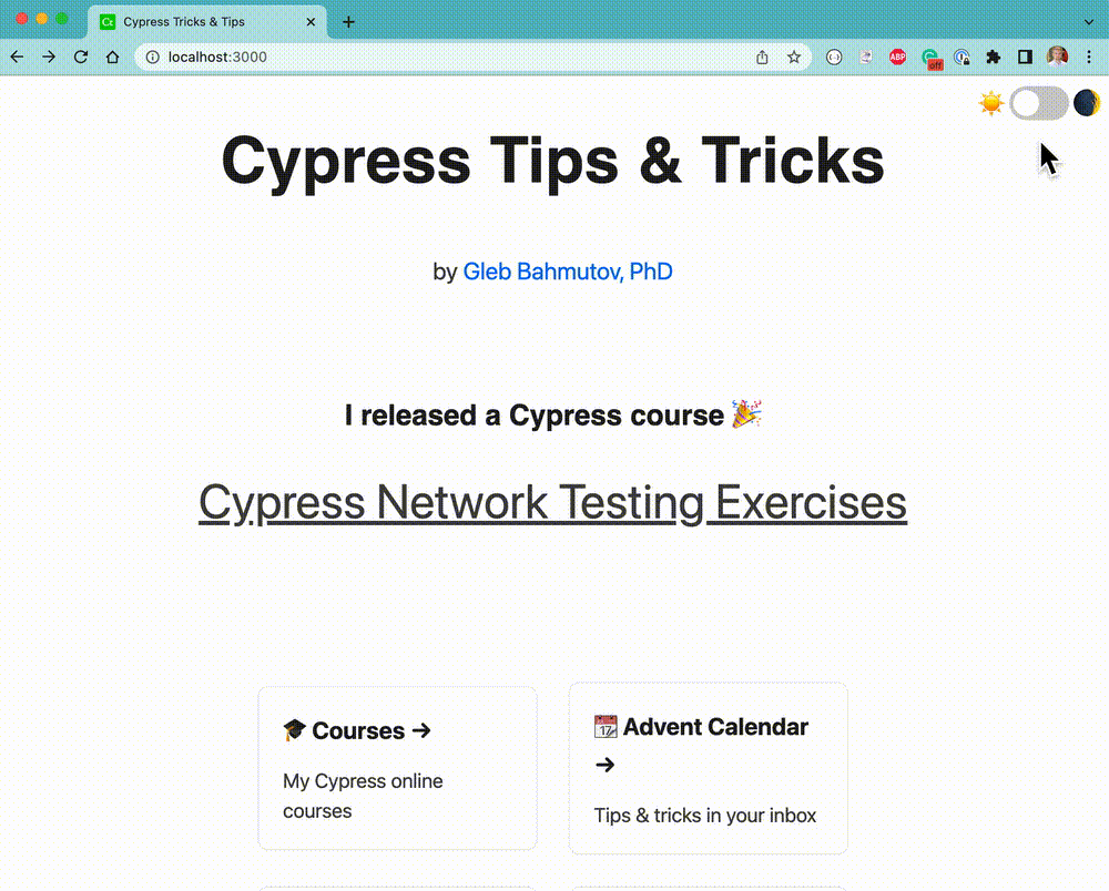
The page looks nice.

The home page with dark theme colors

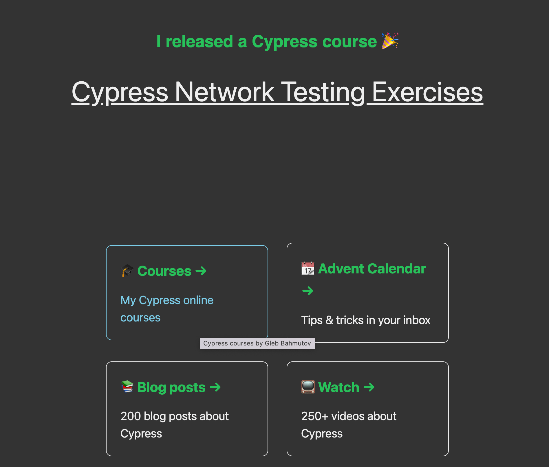
I ran through the pages to make sure all components, like Footer use the color variables instead of local hard-coded colors.

Other CSS tweaks

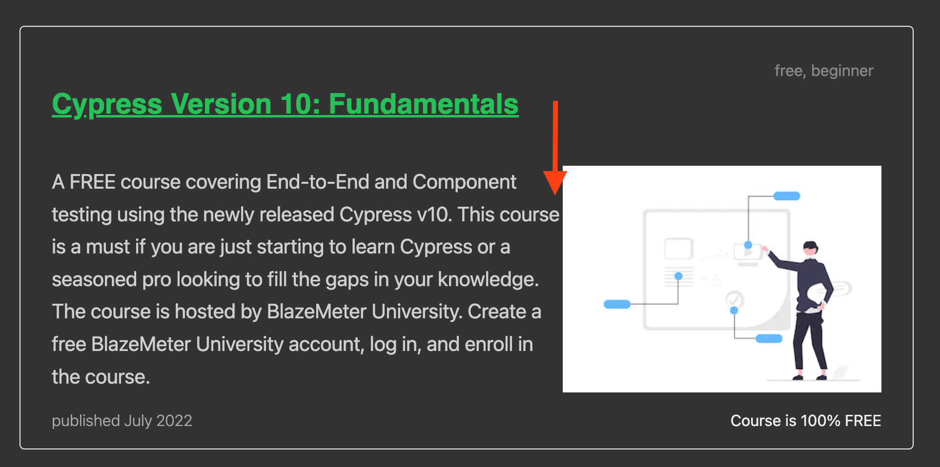
I left the course thumbnail image as they were using the white backgrounds. The dark color theme showed the lack of margin between the course description and the thumbnail image.

The thumbnail image needs left margin

I have added a right margin to the text paragraph.

The toggle component

Now let's copy the React DarkMode component from the repo alexeagleson/react-dark-mode. It checks the localStorage to see if the user has previously selected a color them, with the fallback to the system theme preference.

components/DarkMode.js
1
2
3
4
5
6
7
8
9
10
11
12
13
14
15
16
17
18
19
20
21
22
23
24
25
26
27
28
29
30
31
32
33
34
35
36
37
38
39
40
41
42
43
44
45
46
47
48
49
50
51
52
53
54
55
import React, { useEffect, useState } from 'react'

import styles from './DarkMode.module.css'

const DarkMode = () => {
const [theme, setTheme] = useState(() => {
if (typeof window !== 'undefined') {
const storedTheme = localStorage.getItem('theme')

const prefersDark =
window.matchMedia &&
window.matchMedia('(prefers-color-scheme: dark)').matches

const defaultDark =
storedTheme === 'dark' || (storedTheme === null && prefersDark)
return defaultDark ? 'dark' : 'light'
}
return 'light'
})

useEffect(() => {
if (typeof window !== 'undefined') {
localStorage.setItem('theme', theme)
document.documentElement.setAttribute('data-theme', theme)
}
}, [theme])

const toggleTheme = (e) => {
console.log('toggleTheme')
if (e.target.checked) {
setTheme('dark')
} else {
setTheme('light')
}
}

return (
<div className={styles['toggle-theme-wrapper']} data-cy="DarkMode">
<span>☀️</span>
<label className={styles['toggle-theme']} htmlFor="checkbox">
<input
type="checkbox"
id="checkbox"
// NEW
onChange={toggleTheme}
defaultChecked={theme === 'dark'}
/>
<div className={`${styles.slider} ${styles.round}`}></div>
</label>
<span>🌒</span>
</div>
)
}

export default DarkMode

We have a little bit of styling for the component, and then insert it on the top page

index.js
1
2
3
4
5
6
7
8
9
10
import DarkMode from '../components/DarkMode'

export default function Home() {
return (
<div className={styles.container}>
<DarkMode />
...
</div>
)
}

Now we have the component that flips the "data-" attribute on the document to change the CSS variables and toggle the colors

Toggle the dark and light themes

Adding Cypress tests

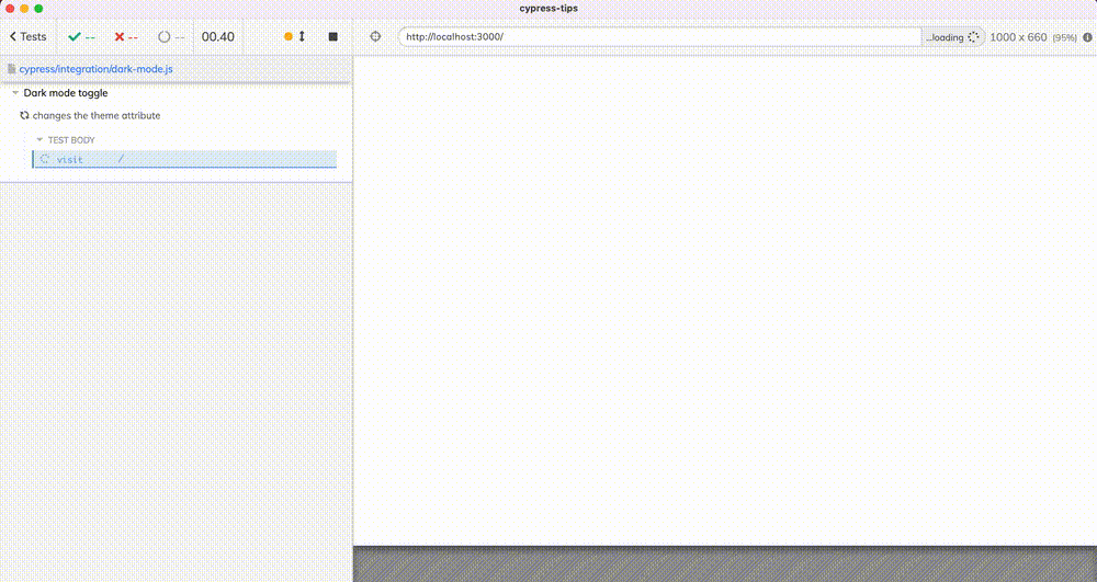
Since I have extensively tested this component in the repo bahmutov/react-dark-mode I will write just one test to make sure the toggle changes the document's data attribute

cypress/integration/dark-mode.js
1
2
3
4
5
6
7
8
9
10
11
12
13
14
15
16
17
18
19
20
21
22
23
24
25
26
27
28
describe('Dark mode toggle', { scrollBehavior: 'center' }, () => {
it('changes the theme attribute', () => {
cy.visit('/')
// Cypress clears the local storage
// so the initial theme is "light"
cy.get('html')
.should('have.attr', 'data-theme', 'light')
// for test clarity
.wait(1000)
// tip: take a screenshot to record on Cypress Dashboard
// even without using visual testing, the image will remain
// a good reminder what what the page looks in the light color theme
cy.screenshot('light', { overwrite: true, capture: 'runner' })

cy.get('[data-cy=DarkMode]').find('label').click()
cy.get('html')
.should('have.attr', 'data-theme', 'dark')
// for test clarity
.wait(1000)
cy.screenshot('dark', { overwrite: true, capture: 'runner' })

cy.reload()
cy.log('**color theme remains dark**')
cy.get('html').should('have.attr', 'data-theme', 'dark')
cy.get('[data-cy=DarkMode]').find('input:checkbox').should('be.checked')
cy.screenshot('dark-after-reload', { overwrite: true, capture: 'runner' })
})
})

Testing the Dark Mode toggle component

You can find the final site at cypress.tips. I should probably add the Dark Mode toggle to all pages, not just the home page.

Client-side rendering

Next.js framework that I am using can render the pages on the server and then re-hydrate on the client (in the browser). Our DarkMode toggle component only makes sense when running in the browser. I looked up in this StackOverflow answer how to dynamically render a component on the client-side.

components/DarkModeToggle.js
1
// the actual DarkMode component
components/ClientOnly.js
1
2
3
4
5
6
7
8
9
10
11
12
13
14
15
import { useEffect, useState } from 'react'
const ClientOnly = ({ children, ...delegated }) => {
const [hasMounted, setHasMounted] = useState(false)

useEffect(() => {
setHasMounted(true)
}, [])

if (!hasMounted) {
return null
}

return <div {...delegated}>{children}</div>
}
export default ClientOnly
components/DarkMode.js
1
2
3
4
5
6
7
8
9
10
11
12
13
14
15
import React from 'react'
import ClientOnly from './ClientOnly'
import DarkModeToggle from './DarkModeToggle'

// wrap the actual toggle in a component
// that only renders it if running in the browser
const DarkMode = () => {
return (
<ClientOnly>
<DarkModeToggle />
</ClientOnly>
)
}

export default DarkMode
pages/search.js
1
2
import DarkMode from '../components/DarkMode.js'
render <DarkMode />

Aria label

I have added the toggle Aria labels for a11y. I made them explain what the toggle will do when clicked.

components/DarkModeToggle.js
1
2
3
4
5
6
7
8
9
10
11
12
13
14
15
16
17
18
19
20
21
22
const label = theme === 'dark' ? 'Activate light mode' : 'Activate dark mode'

return (
<div className={styles['toggle-theme-wrapper']} data-cy="DarkMode">
<span>☀️</span>
<label
className={styles['toggle-theme']}
htmlFor="checkbox"
title={label}
>
<input
type="checkbox"
id="checkbox"
aria-label={label}
onChange={toggleTheme}
defaultChecked={theme === 'dark'}
/>
<div className={`${styles.slider} ${styles.round}`}></div>
</label>
<span>🌒</span>
</div>
)

The test uses the aria labels instead of input:checkbox, for example

1
2
3
4
5
6
7
8
9
10
11
12
13
cy.get('[data-cy=DarkMode]')
.should('be.visible')
.find('input[aria-label="Activate dark mode"]')

cy.get('[data-cy=DarkMode]')
.find('label')
.should('have.attr', 'title', 'Activate dark mode')
.click()
cy.get('html')
.should('have.attr', 'data-theme', 'dark')
// for test clarity
.wait(1000)
cy.screenshot('dark', { overwrite: true, capture: 'runner' })

See also