I have been doing presentations for a while, and I have seen hundreds of them. Here are easy mistakes to avoid when preparing slides.
- Font is too small
- Content too low
- Make links obvious
- Slide numbers
- Personal links
- Make slides stand by themselves
- Text gets lost in background
- Additional slide backgrounds
- Add optional dark theme
- Leave space for the talking head
- Add handwritten text
- More information
Font is too small
The number one problem I see (or rather "can't see") is the font size that is way to small.

Even worse, every slide with small text usually has a LOT of unused space!
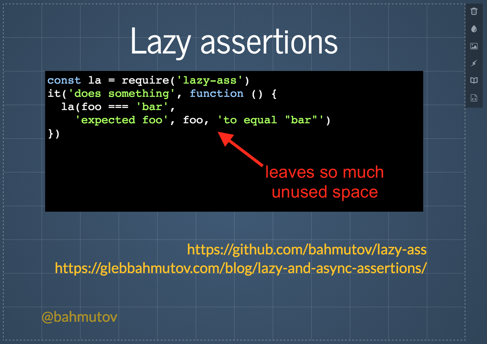
solution - go through each slide and double the font size. Right now. On every slide. It is impossible to make the font too large. Use that white space!
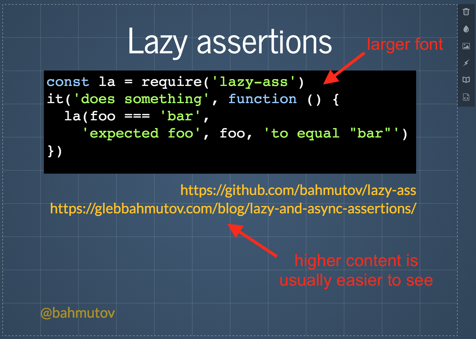
Content too low
If you leave the top part of the slide empty, it naturally pushes the content down, until it becomes it is too low.
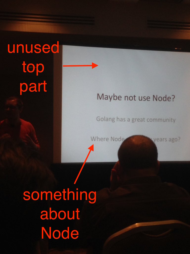
This does not always cause problems for people in the audience - sometimes the projector screen is mounted high, so no harm. Yet often the screen hangs low, and the people in the back rows cannot see the bottom third because of the people in front of them.
solution - use the top part of the slide.
The above slide from the Ben Hall's presentation hits all the right notes:
- the content is high, nothing important is at the bottom
- the font is large and easy to see from far away
- there is a clear link to more information
- leave the bottom of the slide for things that are less important: twitter handle, presentation title, your bank password.
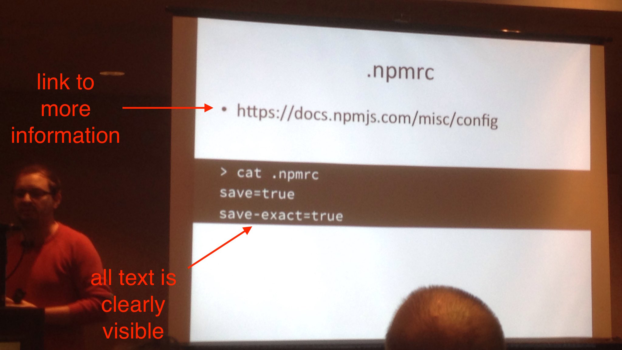
Make links obvious
For a long time, I assumed that people understood that a text in different color below main text was obviously a link to supporting material. And then I was proven wrong. Turns out, no one knew that each slide in my presentations was a jumping point to more material.
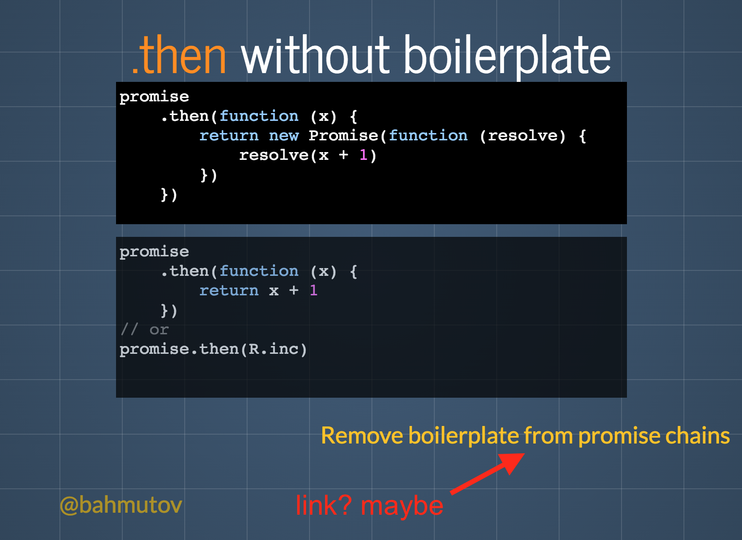
Now I switched my strategy and make the links very explicit.
Links should start with http: or https:, and fit into a single line
(makes selecting them on mobile much simpler).
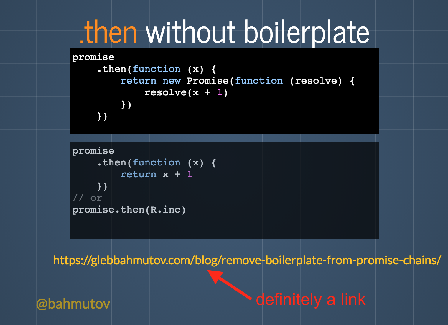
solution - make the link really obvious by using the full URL.
Slide numbers
Long presentations are awesome (more content), yet make it tough to share just particular insight. My audience members sometimes ask me to show slide numbers so they can easily link to a particular slide. Yet my favorite slides.com shows a different slide number from URL hash fragment.
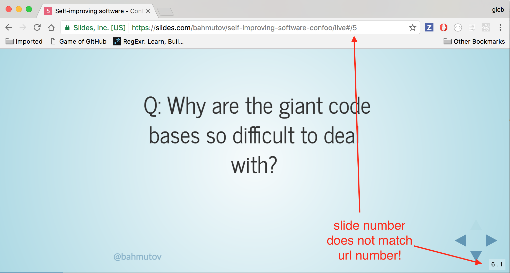
I have not found a good solution to this, except for having good external URLs to share, not the slides themselves. I also sometimes tweet particular slides that I think the audience will find useful by themselves.

Personal links
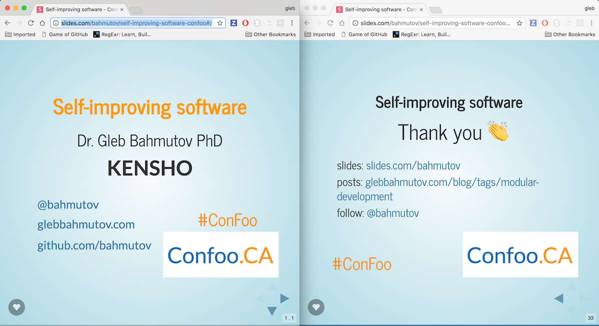
I usually put my contact information at the first and last slides.
I also put my twitter handle @bahmutov in a faint font at the bottom of
most of my slides where it does not interfere with the content.
This allows the audience members who become interested during the talk
(which I am sure is approaching 100% of people by the its end) to look
me up.
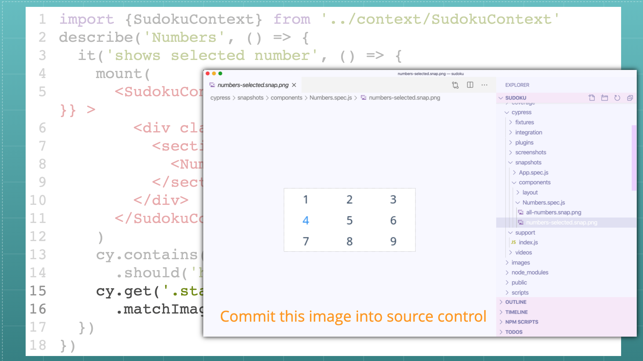
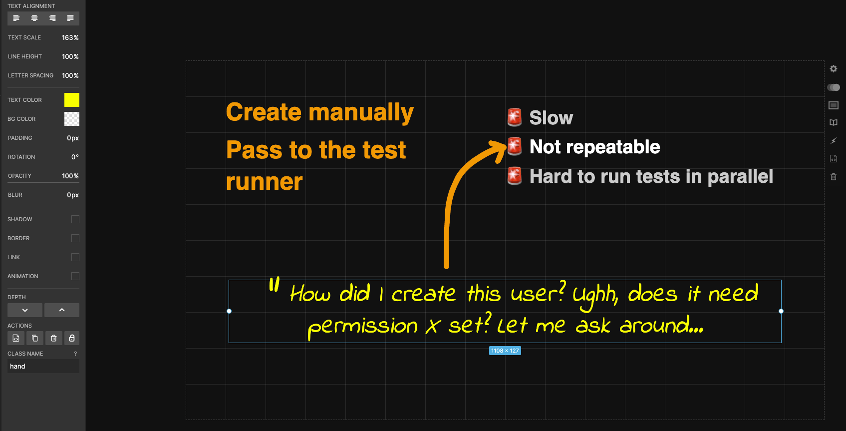
Make slides stand by themselves
The live audience for your presentation will be much smaller than the number of people looking at the slides online. A few hundred people attending or watching the talk video for me is dwarfed by thousands of views the slides are getting. It is imperative to provide a little context to each slide to make them stand by themselves, without the speaker's narrative.
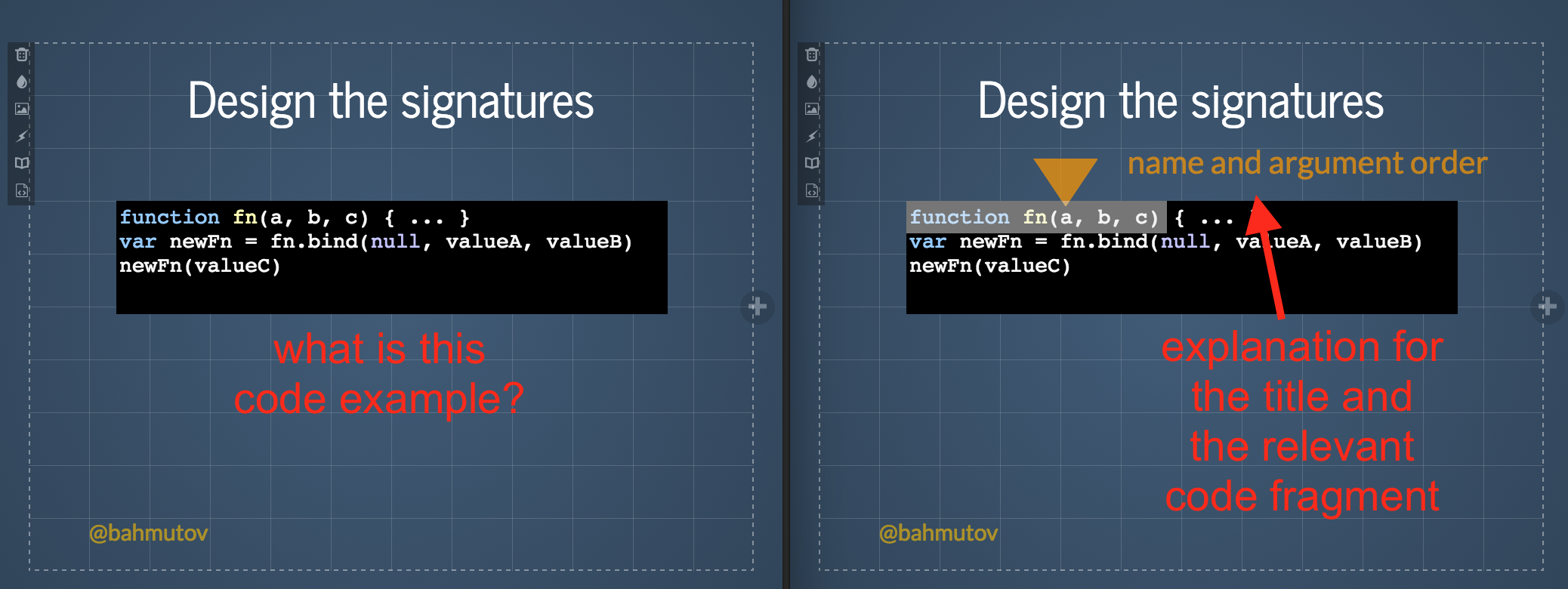
Luckily, just like the example above shows, a little additional text goes a long way in providing a little bit of context to enable anyone reading the PDF of the slides to understand your main idea. No need to write paragraphs of text on each slide (do not do it!), just an extra title or caption.
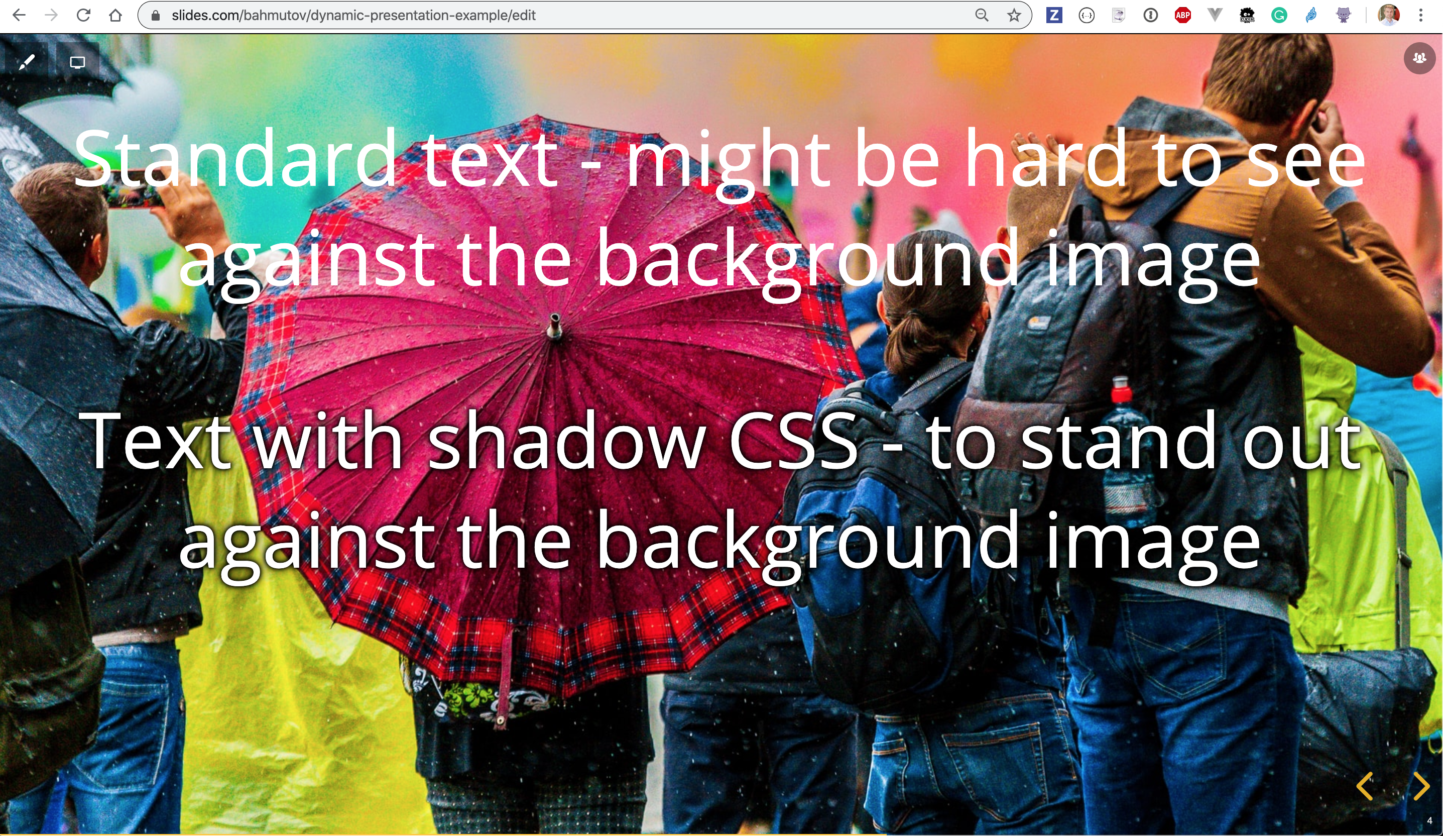
Text gets lost in background
If you use a background image, make sure to add a shadow to the text so it stands out. For example, the text at the top of the image has no shadow and is hard to read. The bottom text has custom CSS class applied with text shadow.
The CSS could be
1 | .text-outline { |
Tip: you can also set black background color and lower the background image's opacity to better separate the foreground text from the image.
For individual images and code boxes, I suggest adding a shadow on all sides
1 | .shadow { |
Note: Slides has added built-in shadows for boxes and text outlines. I still prefer my own text outline for text.
Additional slide backgrounds
You can CSS to control the backgrounds if you get tired of the included backgrounds. For example go to https://cssgradient.io, pick and edit the background you like, then copy its CSS. Open the Slides.com CSS editor and paste the background CSS. For example:
1 | background-image: linear-gradient(135deg, #667eea 0%, #764ba2 100%); |
Gives you a nice purple background

If you want to edit the main and link text, use the following CSS classes
1 | /* Body text color */ |
Add optional dark theme
Whenever I make presentations in a room I prefer to use dark background - because the white background are blinding in a slightly dark room. Thus most of my presentations use dark blue and gray backgrounds. But lately due to COVID, most of my presentations are online, and it is perfectly find to use light color backgrounds.
Because the presentation is shown in the modern browser, I can do the following in the Slides CSS editor utilizing the widely supported prefers-color-scheme CSS property:
1 | /* default style adjustments */ |
If the user has Dark theme OS preference, then they automatically see the dark theme presentation instead of the light one.
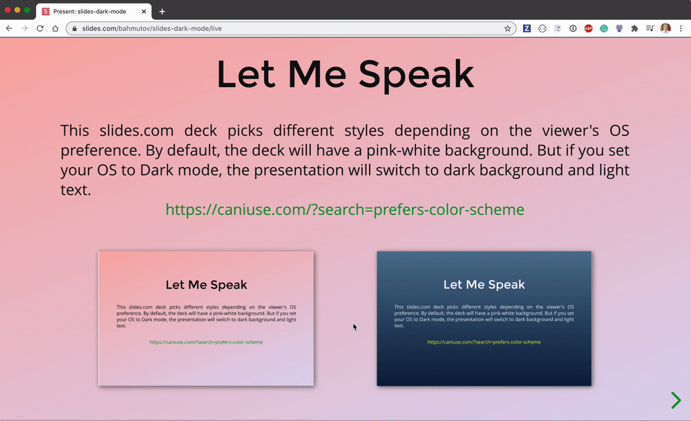
Find the above presentation example at slides.com/bahmutov/slides-dark-mode. Change the theme preference on your device and observe the change.
Leave space for the talking head
If you are going to record a video talking through the slides, then you would probably have your talking head on top of the slide at all times. In that case, you should plan a corner of the video to leave empty. For example, the slides for the talk Using End-to-end Tests as Documentation leave the bottom right corner empty to have my head floating above.
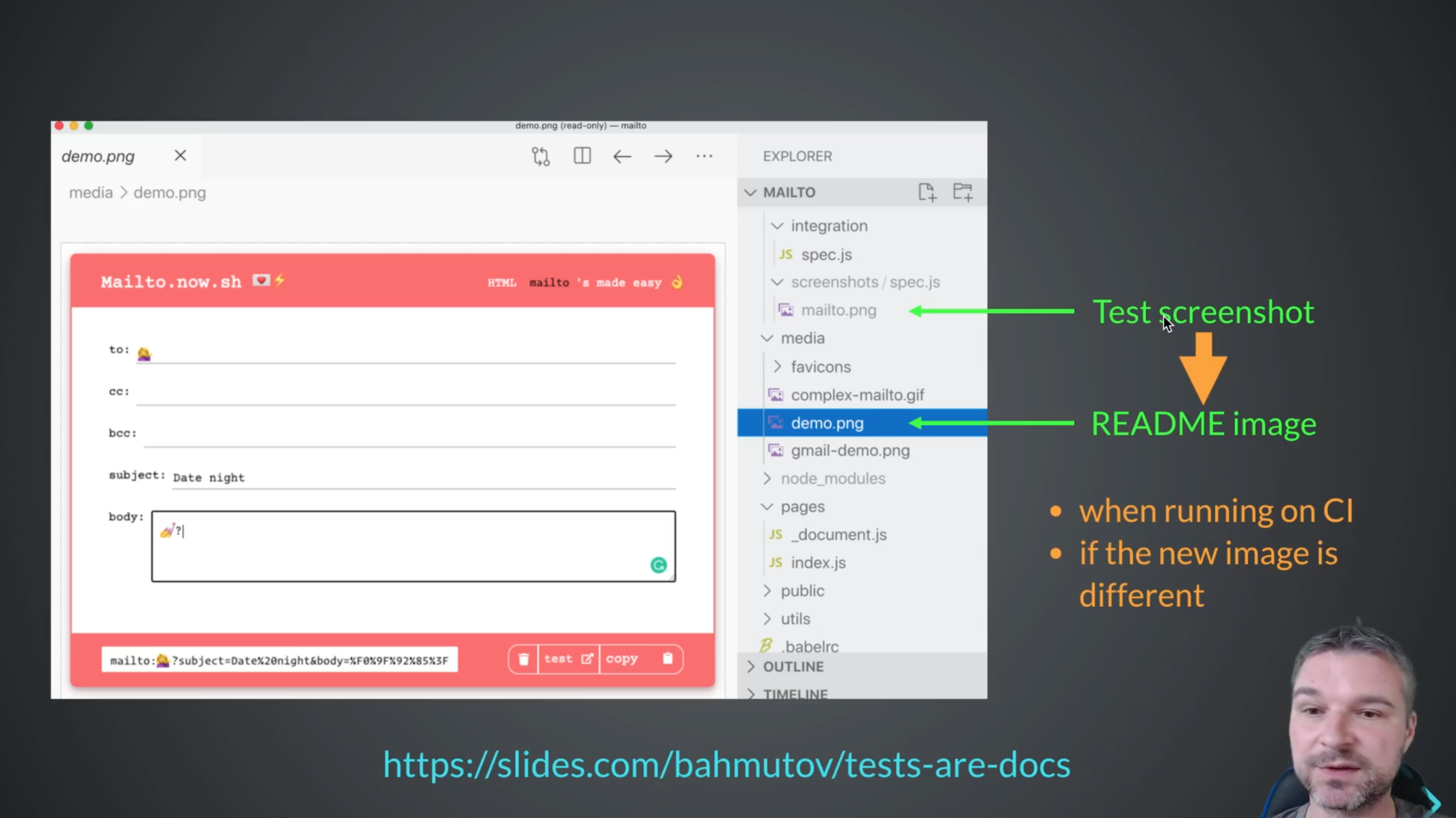
The navigation arrows are fine remaining in the corner, there is no important information lost in the video if they are covered.
Add handwritten text
You can use the following CSS to create a class to apply to any text element to make it look handwritten
To apply a custom Google font, open the CSS editor and click the "Fonts" button. Find the Google fonts you want to use.
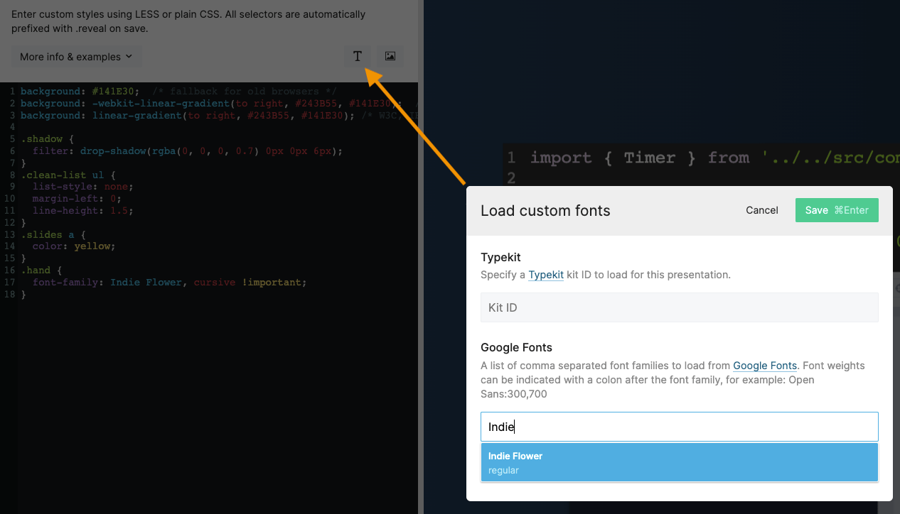
Add a CSS class with the font family and apply it to the text element.
1 | .hand { |
More information
You can find more information on how to deliver good presentations in this presentation (see at https://slides.com/bahmutov/public-speaking)