I was fed up with PowerPoint-style presentation tools, and created my own browser-based presentation viewer called slides-now. Making a slide-based viewer is trivial using HTML and CSS3 transitions, and in this blog post I will go through the 4 steps to achieve the visual transition effect.
Goal
Display individual slides and transition between them on key presses.
Step 1: initial structure
I will use article HTML element to keep my presentation, and individual section elements for each slide. The content is directly a part of the HTML document's body
1 | <body> |
Each section is styled for clarity
1 | section { |
result
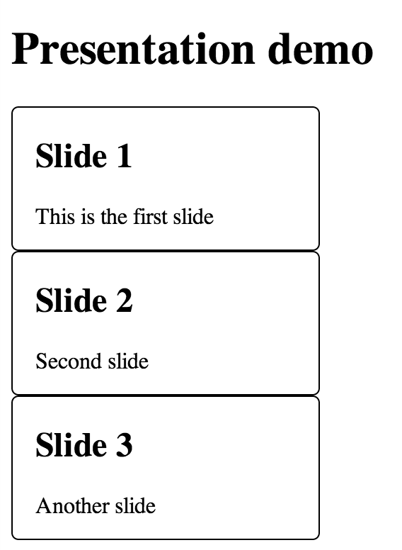
All slides are displayed at once, each block follows the another, just like a list of divs. The slides are styled to be very small for demo purposes, usually a slide would occupy 90-100% of the window's space.
Step 2: simple slide switch in place
Let's display a single active slide at a time. We will need a few additional CSS classes and JavaScript event handler to toggle CSS.
1 | section.active { |
Event handler
1 | $(function () { |
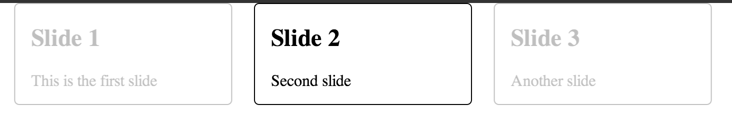
A single slide is active, every other slide is inactive and hidden.
result
I will show the HTML DOM snapshot instead of page. In this case only the second slide is visible.
1 | <article> |
Step 3: prev - active - next slides
Showing a single slide at a time is nice, but the sudden switch to new slide is too abrupt. We would like to slide to the next chunk of content. Before we implement the motion, lets lay the groundwork by positioning the slides first.
Lets introduce two additional CSS classes and position them to the left (previous) and to the right (next) slide.
We are going to position the previous / next slides using CSS transform property, and make it very light using opacity
1 | /* by default slides are placed where top/left tells them */ |
The key press handler becomes slightly more complicated to change all CSS classes on press
1 | if (event.keyCode === 37 && currSlide) { |
result
You can switch between the slides using left / right keys. The transition is sudden, but the slides are positioned correctly for the next step.
Step 4: slide transitions
In this step we are going to interpolate changes in slide position and opacity using CSS3 transition specification.
1 | section { |
The above CSS means that when removing class next and adding class active, CSS
transform property changes from transform: translate3d(110%, 0, 0); to transform: none;
and the browser CSS engine itself will interpolate the changes, making the
entire animation last 0.7 seconds. Same principle applies to opacity: it will
be interpolated from 0.25 to 1.0 over 0.7 seconds.
Our JavaScript remains unchanged: when moving a slide from active to prev state
after clicking right arrow button, all we need to do is toggle CSS class names
1 | $(allSlides[currSlide]) |
Step 4: advanced
An additional detail adds complexity to the correct visual transition.
Let's say the user pressed right key button. The next slide becomes active, moving
according to the CSS transformation. How should next + 1 slide become next?
If there is not position information set, it will appear from the center, which looks weird.
In order to keep things consistent, I wanted next slides to appear
as if sliding from the right. So I introduced two additional CSS classes: before
class is attached to the slides before prev slide. After class is attached to the
slides after the next slide. The only purpose for theses classes is to have
correct position information - they are hidden under prev or next slides waiting
to fade in using opacity CSS interpolation.
1 | .before { |
Next steps
The described visual steps create a tiny presentation engine, running in your browser. Right away I advise you to:
- Use stylus instead of plain CSS to deal better with verbose CSS transforms.
- Use jade instead of plain verbose HTML for faster editing.
- Refactor JavaScript to make initialization and keeping track of active slide easier
- Instead of hardcoding the presentation in HTML body element, load it dynamically, or better yet transform a Markdown document into HTML using marked
- Test your presentation using casperjs
Finally, take a look at these projects:
- bespoke.js slide engine and how it uses 3D effects for next, prev slides.
- Markdown to HTML presentation engine slides-now-core based on bespoke.js
- HTML5 application slides-now based on slides-now-core that adds drag and drop support and offline mode.