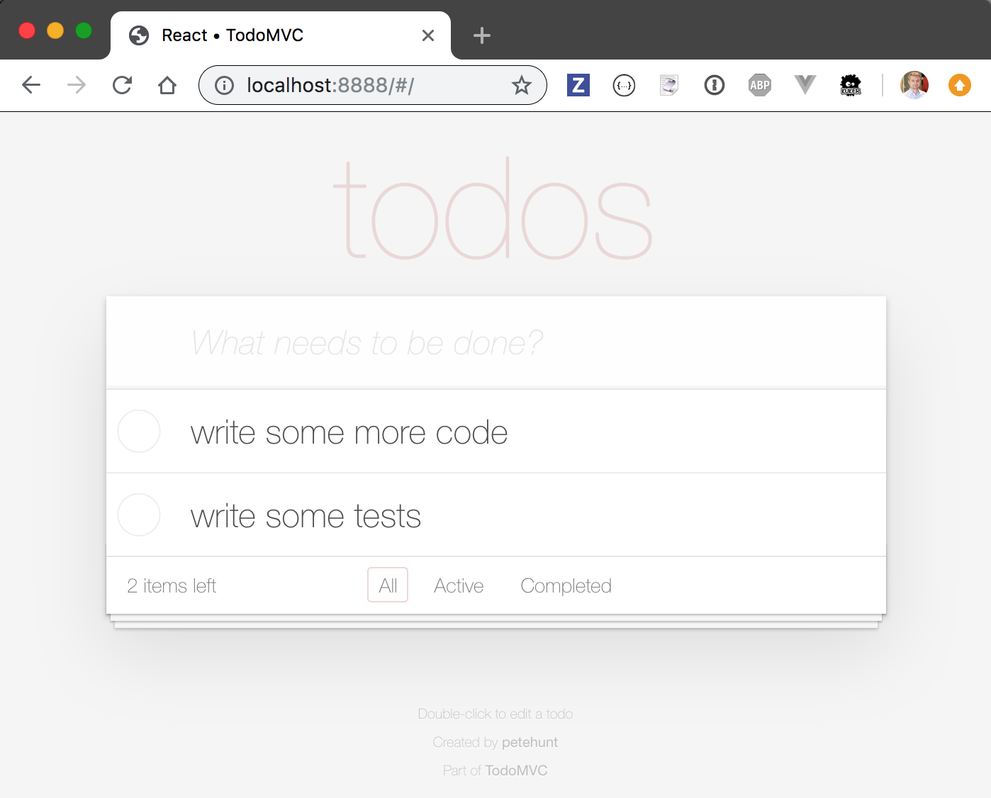
Take the TodoMVC example application that uses the common tastejs/todomvc-app-css styles. For example, the cypress-io/cypress-example-todomvc repo uses them:
1 | <head> |
... and it looks awful on your average projector, the contrast on the page is very low. Most projects display washed out white page where it is super hard to read the individual todo items and labels.
Let's fix this.
Audit
First, we need to understand the problem. Open Chrome DevTools and run "Accessibility" audit.
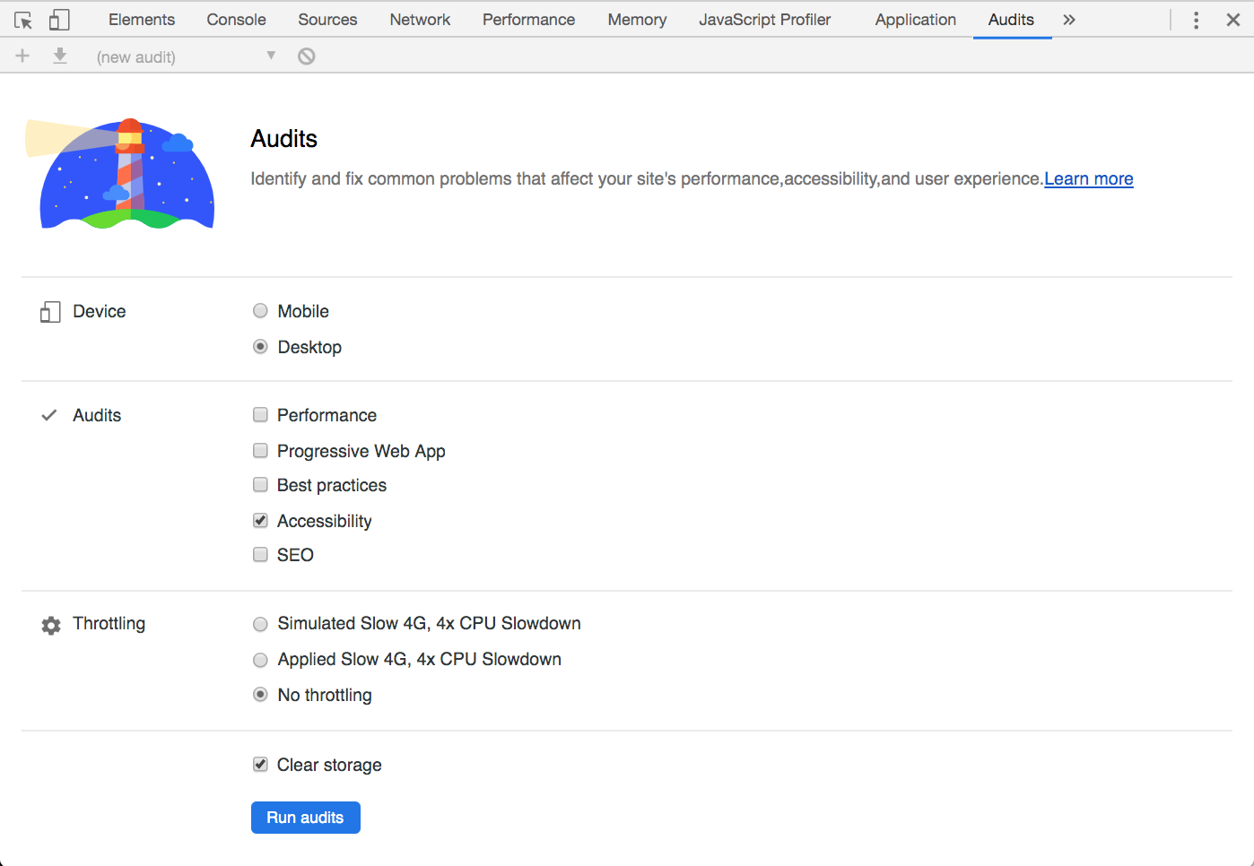
We get only 54 out of 100 - and the contrast is the first problem shown.
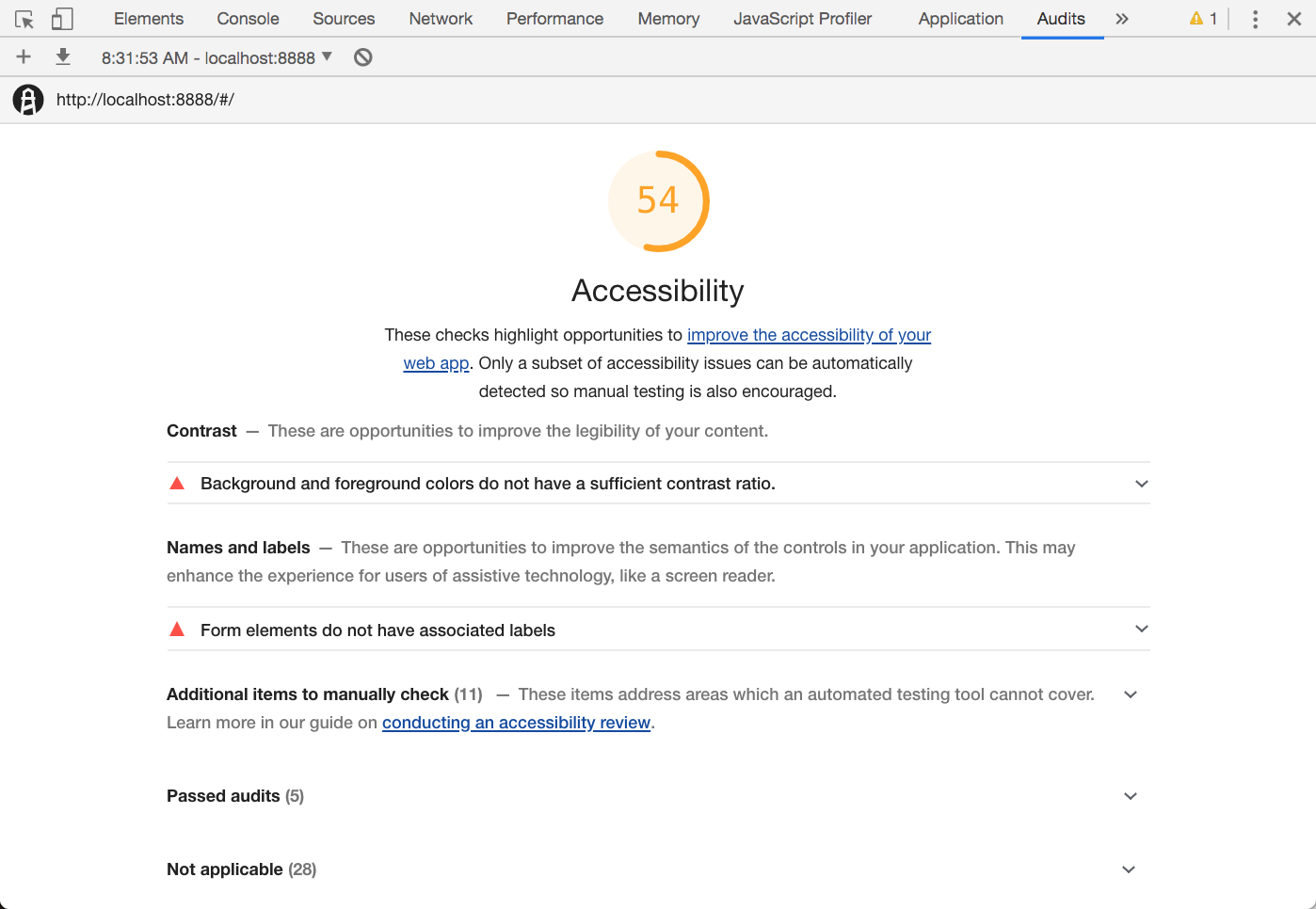
Of course, I am not the first one who had problems showing TodoMVC in front of the live audience and apologizing for the washed out text. Low contrast issue #30 was opened in March of 2018.
Write failing test
Before we start hacking CSS code, let's apply test-driven development approach and write a failing contrast test. I will use Cypress with cypress-axe plugin to run the text contrast check.
1 | npm i -D cypress-axe axe-core |
I have added cypress-axe to the list of loaded commands
1 | require('cypress-axe') |
and wrote a test that only runs a single set of color tests.
1 | it('has good contrast', () => { |
The test fails.
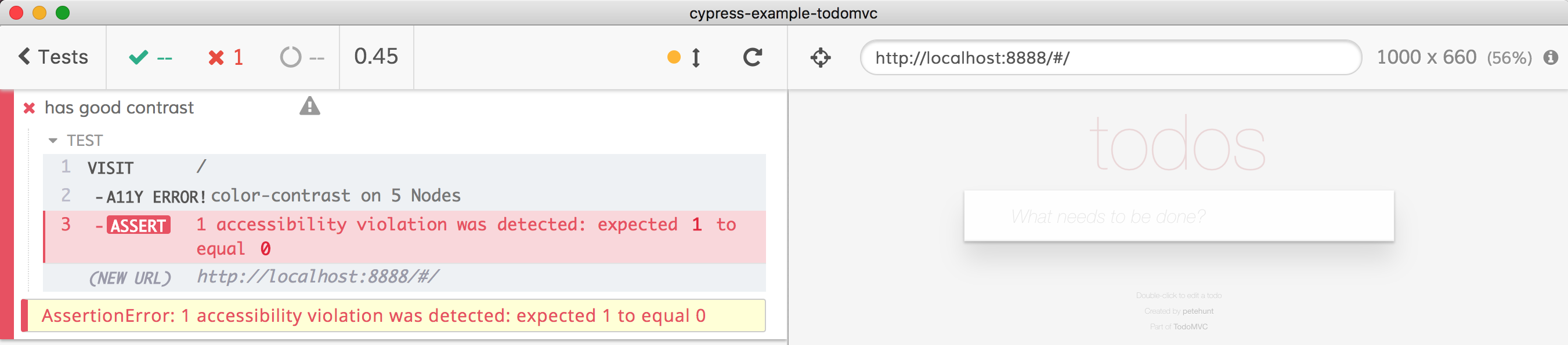
Open DevTools in Cypress and click on the error "A11Y ERROR" command - it will print an actual object with every failed element to the console.
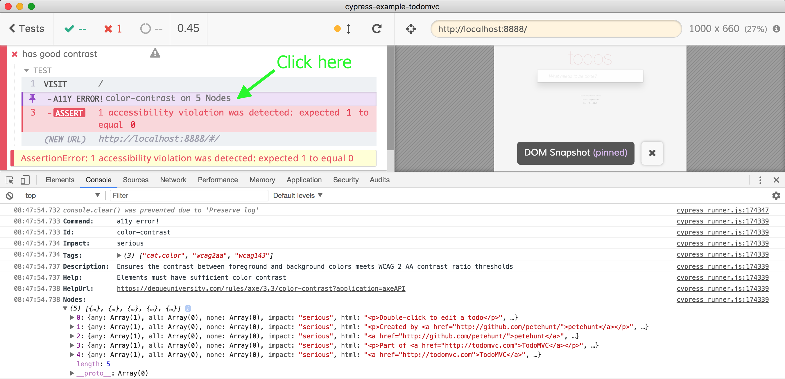
Super. We have a failing contrast test to run on every commit to prevent a11y errors from creeping back into the application.
Fixes
I have copied the node_modules/todomvc-app-css/index.css to css/index.css and included it from the index.html
1 | <link rel="stylesheet" href="css/index.css"> |
Now I can start fixing the problems one by one. DevTools gives me a nice little warning for each element with insufficient contrast via element color picker widget. For example the H1 element with "Todos" title is barely visible.
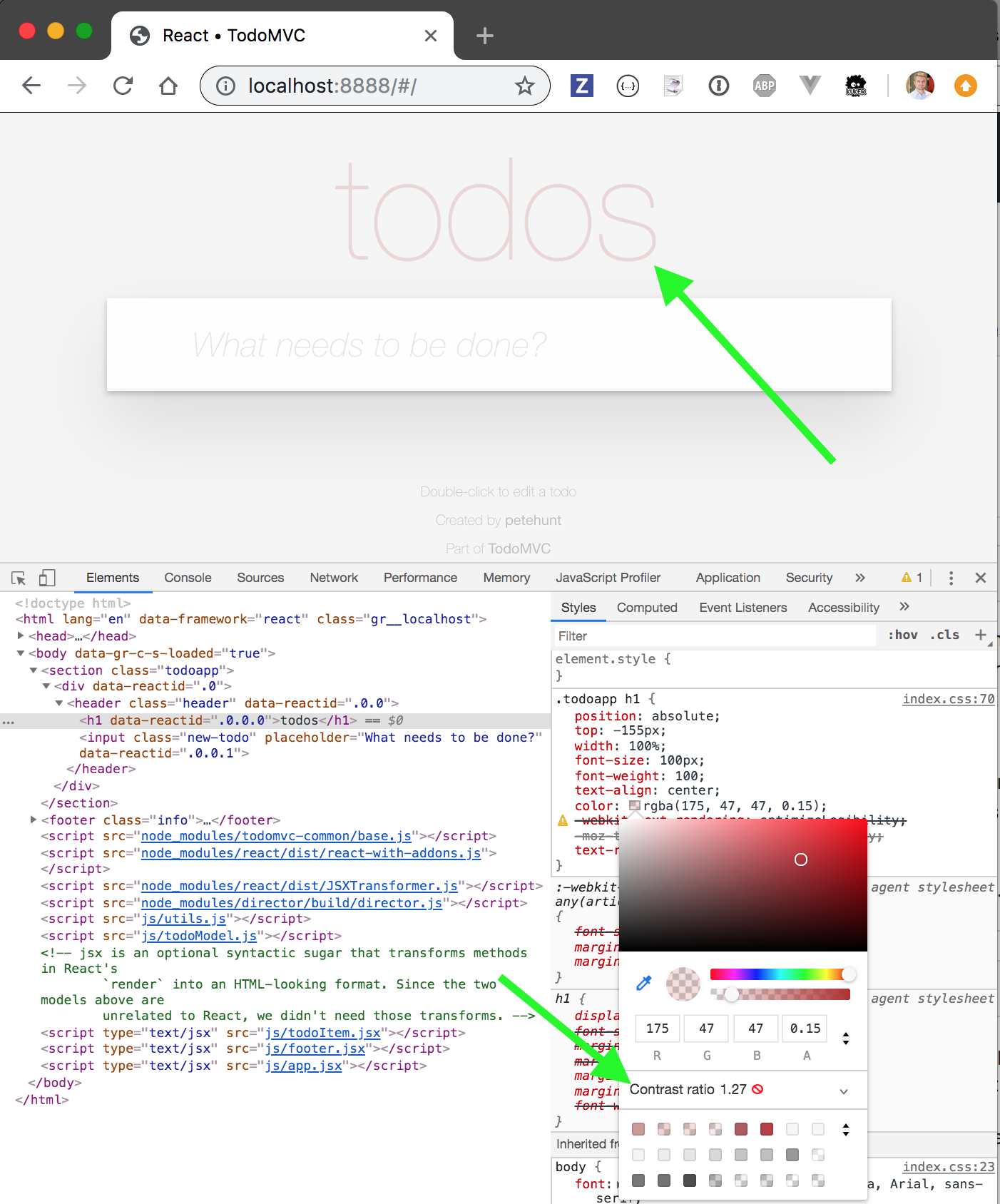
We can pick one of the suggested colors in the palette - which immediately fixes the contrast problem.
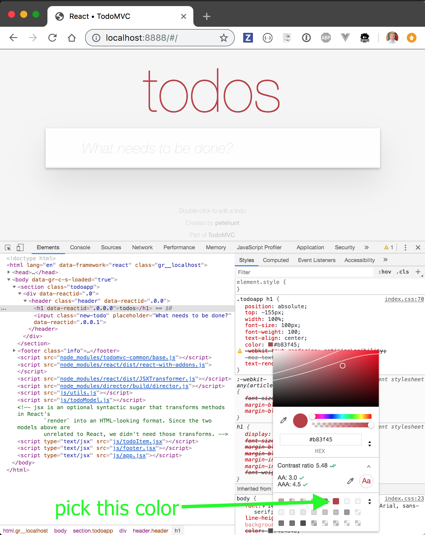
Copy the new color to css/index.css
1 | .todoapp h1 { |
Similarly I have changed the footer.info style to have more contrast
1 | .info { |
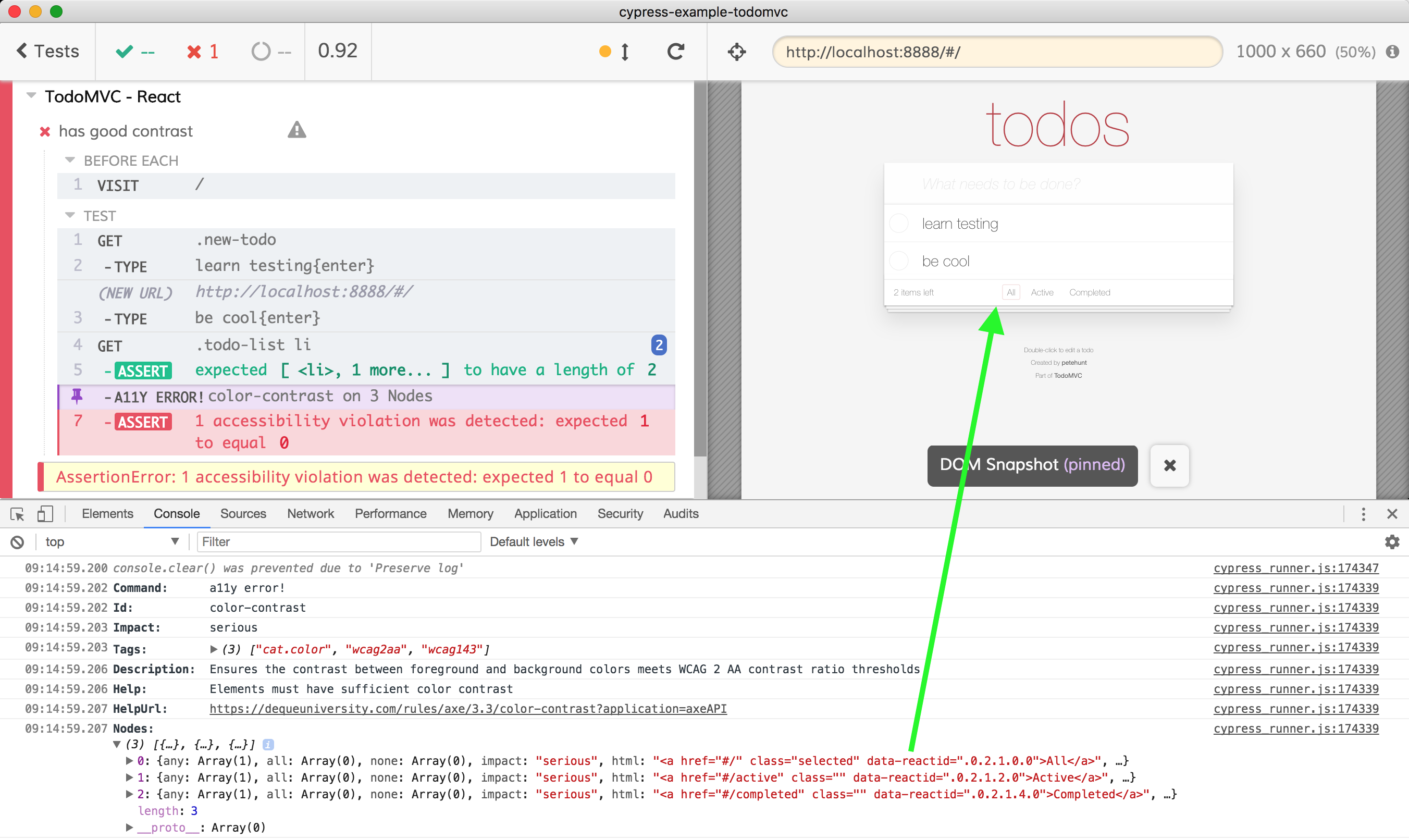
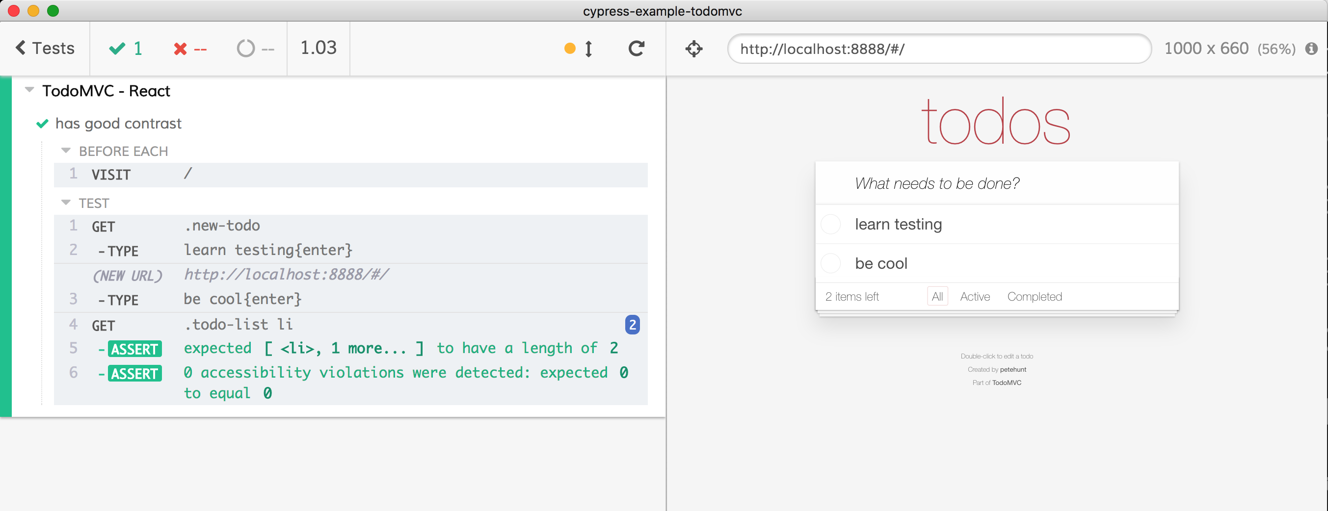
And our empty page passes. The key word is "empty". If we extend our test or write a new test with several todo items, the filters "All|Completed|..." fail the contrast test - which is something the default Lighthouse audit does not reveal (since it runs on the fresh page).
1 | it('has good contrast when empty', () => { |
We can fix this problem by just removing the gray footer font color - it now looks much better with default body color. I also increased the footer font size - it is hard to read it with the current size.
1 | .footer { |
I also made the list element font bolder - I think it is easier to read this way
1 | .todo-list li label { |
And finally I have made the input placeholder text darker - increasing its contrast
1 | .todoapp input::-webkit-input-placeholder { |
The page looks much better after the color changes, and it passes our tests
Links
- You can view my code changes in PR cypress-io/cypress-example-todomvc/pull/124
- I have opened PR tastejs/todomvc-app-css/pull/34 to fix the official
todomvc-app-cssstyles - cypress-axe plugin and Cypress a11y recipe